Dennis Crouch's Patently-O: Patent Pendency Redux |  |
| Posted: 17 Jun 2015 06:14 AM PDT
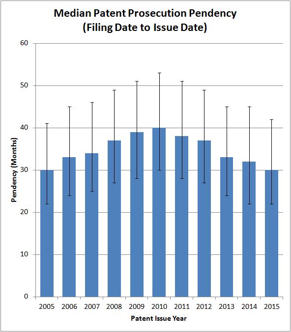
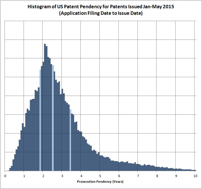
by Dennis Crouch Readers asked for a bit more detail on the patent pendency chart that I posted a few days ago. The first chart below again shows median patent prosecution pendency for utility patents grouped according to issue-year. The chart now includes ‘whiskers’ that show the 25%-75% interquartile range. The second chart shows a more detailed prosecution pendency histogram for all patents issued January-May 2015. The lightly colored bars again represent the median and interquartile range. You’ll note that the pendency histogram is skewed with a long tail. For the chart, I cut-off the display at 10-years even though there are some (a small handful of) patents issued that took more than 10 years to issue. This type of skew typically results in (1) the average pendency being greater than the median and (2) the mode pendency being less than the median. Both of these are true here. With the amount of data here (over 100,000 patents), I would have expected the histogram to be much smoother. My guess is that much of the jumpiness is due to artifacts caused by my monthly grouping and the PTO’s release of patents on a weekly basis. |
| You are subscribed to email updates from Patently-O » Patent To stop receiving these emails, you may unsubscribe now. | Email delivery powered by Google |
| Google Inc., 1600 Amphitheatre Parkway, Mountain View, CA 94043, United States | |
No comments:
Post a Comment